-placement-on-websites)
You’ve designed the perfect landing page on your website. The copy is engaging, the design looks beautiful, and your value proposition is fully transparent. But the conversion rates are still disappointing. What went wrong? More often than not, it’s the placement and design of call-to-action (CTA) buttons.
CTAs bridge user interest and action, and yet, many websites treat them as secondary to the main content. Effective CTA placement requires research grounded in behavioral psychology and applying the principles of user experience design and data analysis. Let’s break down the science of CTAs that convert and how to apply it to help your website.
What Makes a Call to Action (CTA) Effective?
An effective CTA is like a skilled guide – it knows exactly when and how to lead users toward their next step. But what separates a high-converting CTA from one that gets ignored?
First, your CTA should inform users precisely what will happen after they click. Vague phrases like “Submit” or “Click Here” generate friction by requiring users to think. Action words like, “Get My Free Guide” or “Start your 30-Day Trial” have no uncertain terms and give users confidence. But while your CTA needs to catch the reader’s attention easily, it shouldn’t distract them from other page elements.
Examples of Effective CTAs
Let’s examine some real-world examples that demonstrate these principles in action.
Netflix’s “Get Started” strategy is a beautiful example of simplicity. Rather than bombard users with “Sign Up Now” or “Create Account”, they opt to use more passive terms that feel more like starting a journey instead of finishing a transaction. The button also stands out above the fold, with a good amount of white space surrounding it, so it draws attention without overdesigned aggression.

Spotify's “Premium” buttons work well because they focus on the upgrade rather than the payment amount. The yarn color of the button gives a strong contrast against their dark interface, while also being consistent with their brand.

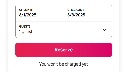
Airbnb is successful with the “Reserve” button placement in multiple ways, including the position and the color they use. The buttons appear after the user has enough information to make a decision (after the user has processed the images, reviews, and availability). Coral pink doesn’t only stand out against numerous neutral backgrounds, it also has psychological effects associated with warmth and hospitality and is consistent with their brand promise. The placement is in the order users naturally read by presenting it after the very important decision-making information.
The Science Behind Impactful CTAs
Knowing the psychology of users is key to creating CTAs that actually engage them. A number of cognitive principles emphasize why some methods have been proven superior to others.
Color Psychology
Each color produces different psychological responses, which can facilitate or hinder the effectiveness of your CTA. Red creates urgency and excitement, has a potential effect of increased heart rate, and requires immediate response. Red is often useful for “Limited Time Offer” or “Buy Now” CTAs.
Orange is a combination of red’s energizing properties and yellow’s friendliness. Orange has the potential to encourage favorable reactions in the user to “Get Started” or “Sign Up” CTAs. Green is psychologically suggestive of “go” or the sense of safety, which makes users feel safe to go ahead. Green is also excellent for submissions on forms and downloads. Blue indicates trust and signals reliability, which works well for B2B CTAs or any financial services.
It is worth noting, color psychology does not float independently; it will have to operate within the confines of your brand context, as well as any cultural implications. The most critical thing is that there is sufficient contrast against your background, as well as consistency with your entire design language.
Placement
Strategic placement takes advantage of natural user behavior. For example, eye-tracking studies have found that website users have consistent scanning patterns. When scanning landing pages on a desktop, website users generally scan the page in a Z-pattern; they start at the top left of the page, scan right, and move down diagonally across the page and back to the left. When the page is more content-heavy, however, the user scans a page in an F-pattern. The user will start at the top of the page and mainly scan downwards on the left side, occasionally scanning the right side.
One consideration is that you want to place your primary CTA at the end of the user’s natural scanning paths. While placing a CTA above-the-fold works for website visitors who are willing to take immediate action, studies show that users who have the needed information to make a decision, generally convert better than users who may be placed too early in the decision-making process. Remember that the appropriate placement of the CTA needs to reflect the user’s intent and their natural consumption pattern of scanned information.
Urgency
Urgency-based CTAs are highly effective. People are more motivated to avoid losses over equal gains. CTAs that include “Don't Miss Out” and “Limited Time Only” leverage this cognitive bias. However, too many of these can lead to banner blindness.
The paradox of choice is another reason why simple CTAs outperform complicated ones. When presented with too many choices, users are unlikely to select any option. This is why it’s typical to see single, more dominant CTAs convert better than multiple distracting buttons. If you must include more than one, be sure to create a strong visual hierarchy and distinguish primary actions from competitors.
Fitts’ Law
Fitts’ Law from the field of human-computer interaction offers guidance on all targets including button size and placement. Larger targets are easier to click, and target placement is more impactful than target size. Where you display the call-to-action matters too; consider where users are expected to look. Also, consider how far the mouse cursor (or thumb, on mobile devices) would have to travel to click the button.
These are all considerations to have before designing a CTA. Along with size, make use of white space to help it stand out easily. While Fitt’s Law sounds like a very technical term, it is fairly simple to understand and execute.
The Impact of Effective CTAs
The difference between mediocre CTAs and exceptional CTAs can be night and day. Slight modifications to the design, placement, or copy can produce outsized results that trickle down to your entire conversion funnel.
Higher Conversion Rates
Conversion rates can increase significantly when CTAs are optimized effectively, but of course their impact isn’t limited to driving link clicks. Better CTAs provide an improved experience for the user by making the next steps less confusing and more intuitive to navigate. The more easily users can find and understand what to do next, the more inclined they are to deepen their engagement with the content and return in the future. There is a good chance they may make a purchase during their next visit.
Improved Brand Perception
Brand perception improves when users view CTAs and other prompts as helpful, rather than pushy. Users appreciate when a website helps them easily find what they want, without aggressive selling. This establishes trust, which increases the chances that users will refer your brand through word of mouth.
Greater Discoverability
An effective CTA helps your brand be memorable. A well-designed one makes an impression on the viewer, which they are likely to remember. Strategically using CTAs helps your products or services be shared on social media as well, letting newer audiences discover them.
How to Test CTAs
Start with hypothesis-driven testing. Before you test anything, form a clear hypothesis about why a change might improve performance. “I believe changing the CTA from ‘Learn More’ to ‘Get Started Today’ will increase clicks by 15% because it’s more specific and action-oriented.” This approach helps you learn from both successful and unsuccessful tests.
A/B testing fundamentals apply strongly to CTAs. Test one element at a time – color, text, placement, or size – so you can identify what actually drives changes in performance. Run tests long enough to reach statistical significance, typically requiring at least 1,000 conversions per variation for reliable results.
Testing for mobile is important because mobile users interact differently with CTAs. What works for desktop may not always work on mobile platforms. Placement on mobile needs to accommodate thumbs, and sizing needs to provide appropriate touch targets. Copy, on the other hand, should be easily readable and flow with other elements.
Conclusion
Successful CTAs are the result of understanding user psychology and applying commonly accepted UX principles, while also continually testing and refining using real user behavior.
The CTAs on your website are much more than just buttons; they’re converging points of interest where user interest turns into a user action. By applying the science to effective CTA placement, you are driving not only conversion but also the overall user experience for them, and ultimately, your business.
The next time you design a CTA, ask yourself: Is it a button that makes the next step obvious, valuable, and easy? If the answer is yes to all three, you’re on the path to CTAs that convert.
FAQs
What is the Meaning of CTA?
CTA stands for “call-to-action”. It is a strong visual prompt on a website or ad that encourages a viewer to click on it to receive a benefit.
What is a Call to Action Example?
A good example of a CTA is the ‘Reserve’ button on Airbnb’s properties. The “Subscribe” button on YouTube, as well as Netflix's “Get Started” button on the homepage, are also good examples.
Why are CTAs Important?
CTAs are important as they help prompt viewers to take action. This action often involves them subscribing or making a purchase. These either result in a sale or the acquisition of potential leads for a business.
Do Call to Actions Work?
Yes, they definitely work. Having CTAs on your website can increase your conversion rate considerably.
How do You Write a Call to Action?
Make sure you position it in a way that is beneficial to the user. It should emphasize that benefit and it can also be useful to have a sense of urgency.